

From Work Mode to Me Mode
Helping people shift from “work mode” to “me mode” with less decision fatigue and more delight. This end-to-end project moved from early research through high-fidelity prototyping and testing, guided by an agile, iterative process.
Project Overview

Project Goal:
Indigo is a mobile-first app designed to help users transition out of “work mode” and into “me mode” with intention, ease, and delight. The true challenge wasn’t simply about helping users “unwind” after work, it was about intentionally disrupting the passive habits (scrolling, streaming, over-scheduling) that fill our post-work hours and leave us feeling unfulfilled. I needed to design a solution that helped users transition emotionally from work mode to “me mode”, while accounting for common blockers like decision fatigue, screen overload, and the pressure to be productive.
The deeper challenge was how to inspire intentional, joyful action, without relying on gamification, social pressure, or dopamine-driven features. This required designing something deceptively simple but emotionally intelligent.
My Role:
I served as the sole UX/UI designer, guiding Indigo from concept to high-fidelity prototype. My responsibilities included user research and persona creation, mapping task flows, and defining feature priorities. I designed the visual identity, wireframes, and final interface in Figma, then conducted usability testing with Maze to validate and refine layouts, copy, and interactions for a seamless user experience.
Tools:
Figma, Maze, Google Meet
The Problem
After a long workday, many people want to feel grounded, restored, or simply joyful. However, decision fatigue, digital overload, and burnout can make it difficult to plan something meaningful. The very tools we use to help us unwind - social media, streaming, or event apps - often pull us deeper into distraction rather than ease.
The Solution
Indigo offers one intentional prompt per day based on a user’s mood, energy, and preferences. With features like a “randomizer” and options to filter out screen time or spending, it removes friction from the post-work hours. The app encourages presence, curiosity, and small moments of joy.
Research
User Interviews
I conducted 5 in-depth interviews with people aged 28–40 who work full-time and often feel disconnected from themselves in the evening. Interviews focused on:
After-work habits
Friction points in planning free time
Feelings about screens, money, and productivity
Key Questions Included:
How do you usually spend your weeknights?
What keeps you from doing something joyful after work?
What role does technology play in your downtime?
How do you decide what to do after 5pm?
Key Insights
People crave presence, not productivity
Planning is a barrier
Small moments are enough
Choice fatigue is real
These insights informed prompt design, screen flow, and feature prioritization.
Quantitative Highlights
100% of participants said they often defaulted to scrolling on their phone after work, despite wanting something more fulfilling.
75% reported wanting to try something new in the evenings, but felt “too tired to plan.”
50% expressed frustration with how often “fun” still required spending money or making multiple decisions.
3 out of 4 participants said they avoided attending events or activities after work if it required screen time or felt like work to organize.
Affinity Map Debrief
Key User Groups
Five distinct users provide diverse perspectives that reveal both shared and unique challenges related to managing energy, motivation, and social connection in daily life.
Energy & Fatigue
Users consistently describe a depletion of post-work energy that affects their evenings, both physically and mentally. Despite wanting to engage in activities after work, many feel unable due to exhaustion, reflecting a complex interplay of fatigue, inertia, and sometimes guilt.
Emotional Needs & Mood
Emotional states are complex and tied closely to users’ ability to rest or engage in meaningful activities. Several users express feelings of anxiety, guilt and restlessness when trying to balance productivity with rest. The emotional connection to activities is critical, showing that users crave meaningful experiences rather than just filler tasks.
Decision-Making & Planning
Users face decision fatigue, especially in the evenings. They prefer simple, guided options that reduce mental load. The data suggests that structured yet flexible prompts can help streamline decision-making.
Restorative Activities & Desires
Even small, simple activities that feel restorative are highly valued as ways to recharge. Users want these activities to feel enjoyable rather than burdensome, emphasizing restoration over productivity.
Pain Points
Fatigue and guilt around not using time “productively” weigh heavily on users. Physical pain and emotional resistance after effort further complicate users’ ability to maintain consistent evening routines.
Overall Insights
Users desire personalized, non-overwhelming suggestions that respect their limited energy and emotional bandwidth in the evening. The ability to balance meaningful rest with social connection and low-effort creativity is essential. The product should help reduce decision fatigue and promote restorative, enjoyable activities that feel tailored and achievable.
Persona Highlight
Goals
Shift from task-mode into presence and joy
Reclaim evenings without pressure to “be productive”
Discover new experiences with minimal planning
Key Insights
Users wanted recommendations based on their mood and energy
Decision fatigue was a pain point: too many options = inaction
People preferred suggestions that don’t require screen time or money
Tracking progress, even minimally, gave a sense of momentum

Competitive Audit
To better understand the landscape of wellness, planning, and post-work decompression tools, I conducted a competitive analysis of four apps: Headspace, How We Feel, No Plans, and Finch. Each tool offers a different approach to helping users feel more grounded, present, or productive, but none directly address the intersection of intentional rest, frictionless planning, and analog joy that Indigo aims to serve.
-
Strengths:
Trusted brand, excellent for guided meditation and breathwork. Strong focus on emotional regulation and sleep.
Weaknesses:
Passive experience. Requires users to sit still and listen. Doesn’t address people who want to do something playful or social.
Takeaways:
People want to feel better, but sometimes that means movement or action, not stillness.
-
Strengths:
Beautiful, intentional UX. Emotion-first approach. Offers reflection tools and emotional education.
Weaknesses:
No concrete suggestions for what to do based on mood. Lacks action-oriented feedback loops.
Takeaways:
Confirmed value of starting with feelings and reinforced Indigo's "you feel first, we respond" model.
-
Strengths:
Hyper-local event discovery. Celebrates spontaneity and minimal planning.
Weaknesses:
Still tied to scrolling, decision fatigue, and external events. Not screen-free.
Takeaways:
Users want the feeling of spontaneity without the effort of decision-making or coordination.
-
Strengths:
Encourages daily check-ins, self-care quests, and emotional validation through gamification and a virtual pet.
Weaknesses:
Can feel juvenile or overwhelming. Gamification doesn't appeal to everyone.
Takeaways:
Delight matters, but Indigo should use it sparingly and age-appropriately to foster calm, not chaos.
Opportunity Identified:
There’s a clear gap between wellness apps that are passive or gamified, and planning apps that add more cognitive load. Indigo aims to meet users in a playful, lightweight space where they can explore presence without scrolling, planning, or spending. It’s not about “doing more,” but about helping people feel more with clarity and intention.
Feature Roadmap
Must Have Features
These directly address the primary user pain point: decision fatigue after work.
Daily Prompt Generator - Delivers a single personalized activity suggestion after 5 PM, factoring in mood, energy, and location. Strongly validated by users who expressed mental fatigue and difficulty deciding on activities.
Mood & Energy Input - Quick daily check-in ensures relevance of suggestions, building trust through personalization.
Snooze Button (Low-Energy Alternative) - Empathetic feature for users feeling too drained to engage, offering softer, low-effort alternatives.
These features ensure relevance, accessibility, and trust, tackling the problem of “wanting to do something, but not wanting to decide what.”
Nice-to-Have Features
These enhance social connection, engagement, and convenience, but are not essential for launch.
Share Prompt Button - Supports organic growth through social sharing.
Push Notifications (Smart Timing) - Gentle reminders around peak decision time (5 PM).
Basic Filters - Simple indoor/outdoor or solo/social filters to refine suggestions.
These features aim to boost engagement and prevent drop-off, but can be phased in post-MVP.
Surprising & Delightful
These features create emotional stickiness and playful moments, boosting long-term retention.
Affirmation or Completion Feedback - Celebratory animations or affirmations after task completion.
Secret Delight Prompts - Occasional fun, unexpected suggestions to spark joy.
Randomizer Button - Removes decision-making entirely, appealing to highly indecisive users.
They’re not essential for functionality, but add charm, reduce friction, and enhance emotional connection.
Can Come Later
Long-term value drivers that require more technical investment or user base growth.
Mini Streak Tracker / Journal View - Supports long-term habit tracking and reflection.
Social Prompt Linking (Friend Mode) - Encourages shared experiences but requires social infrastructure.
Location-Based Prompt Customization - Deepens personalization using public data sources (weather, events).
These features strengthen engagement over time but are not necessary for validating the core concept.
Key Takeaways
User research heavily guided prioritization - quotes and observations directly shaped which features became MVP essentials.
Core focus is on reducing decision fatigue through simplicity, personalization, and empathy for low-energy states.
MVP scope is intentionally narrow to validate the central promise, with a clear roadmap for engagement boosters and advanced personalization later.
Emotional resonance and trust-building are embedded in even the earliest features, ensuring a strong foundation for retention.
Site Map

User Flow
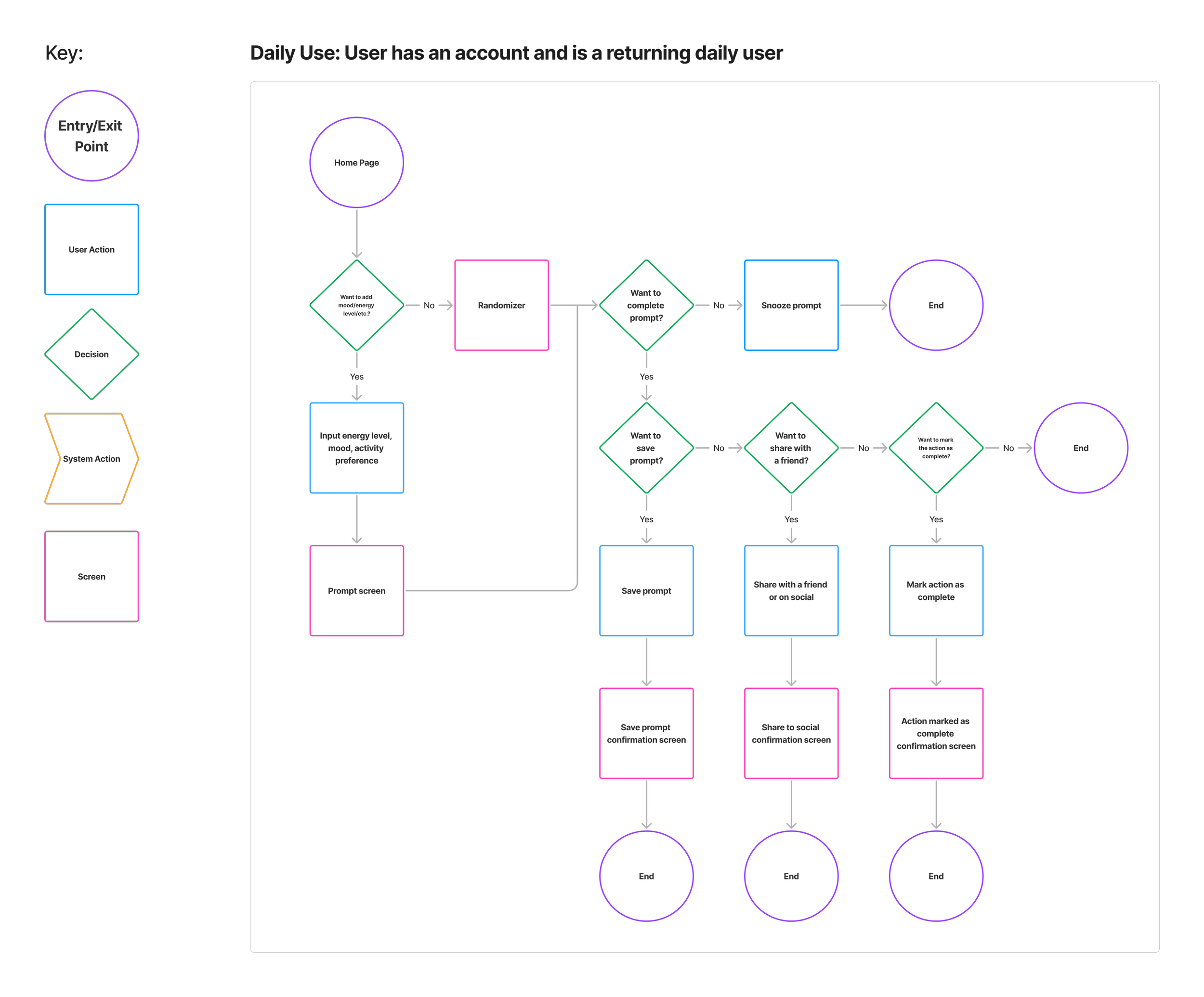
The main objective of creating the user flow was to map the user's decision-making process from the moment they opened the app to the completion of a prompt. I wanted to understand the most intuitive sequence of steps a user would take to get from intention to action with as little friction as possible.
By visualizing how users would move through the app, from everyday use (mood, energy, preference inputs) to receiving and completing a prompt, I was able to identify critical interaction points, opportunities for delight, and places where users might hesitate or drop off.
Using interview data and testing patterns, I mapped two core flows:
The everyday user – Mood, energy, and activity preference inputs
Randomizer – Skip setup and get inspired instantly
This hierarchy informed every screen decision.
This clarity directly informed my low-fidelity wireframes by:
Ensuring each screen had a clear single purpose
Keeping navigation simple and forward-moving
Prioritizing key actions like “Surprise Me” and “I Did It” early in the design
Reducing unnecessary choices and screens
In short, the user flow helped me turn emotional intent into functional design by laying a clean foundation for wireframing a smooth, purposeful experience.

Prompt

That’s it for today

How are you feeling?
Lowfi Wireframes
Homepage
Invisible screen for clarity

Empty state screen

Wants for tonight

Push notification

Randomizer

No-gos?

Completion quote

Design Evolution
Wireframes
Started with hand-drawn sketches that focused on:
Mood and energy sliders
Large CTAs like “I Did It!” or “Surprise Me”
Minimal copy and visual clutter
Early testing showed a need for:
Friendlier language during onboarding
Larger interaction targets
Clearer navigation hierarchy
Revisions & Refinements
Throughout the design process, we made targeted revisions to ensure Indigo’s UI felt cohesive with the brand identity while improving usability. Feedback from internal reviews and early visual testing guided these changes.
Illustration Color Adjustments
Before: Early illustrations used vivid, highly saturated colors that, while fun, felt slightly disconnected from Indigo’s calm, evening-inspired palette.
After: We refined the illustrations to use muted tones drawn directly from the brand color system. This not only created visual harmony but also supported the app’s calming tone, preventing the artwork from overpowering the core content.
Before

High-Fidelity Designs
With the Indigo name anchoring visual identity, I developed a color system reflecting calm and curiosity. High contrast, legible fonts, and warm visual language set the tone.
Final features included:
Daily affirmations
Save/share prompt screens
Delight sections like “secret prompt archives”
After

Improved Button Visibility
Before: The original buttons had less contrast against the gradient backgrounds, making them visually subtle but sometimes harder to see, especially in dim lighting.
After: We increased contrast by lightening the background and ensuring text met accessibility standards for color contrast. This small change greatly improved tap target visibility and made primary actions more intuitive.
Balancing Playfulness & Usability
These adjustments struck a balance between keeping the UI lighthearted and ensuring that key interactions, like mood selection, prompt viewing, and completion actions, remained clear and easy to use.
By aligning illustrations with brand colors and improving visual contrast, the final design feels both on-brand and highly usable, delivering an experience that’s warm, approachable, and accessible.
Style Guide
Style Guide

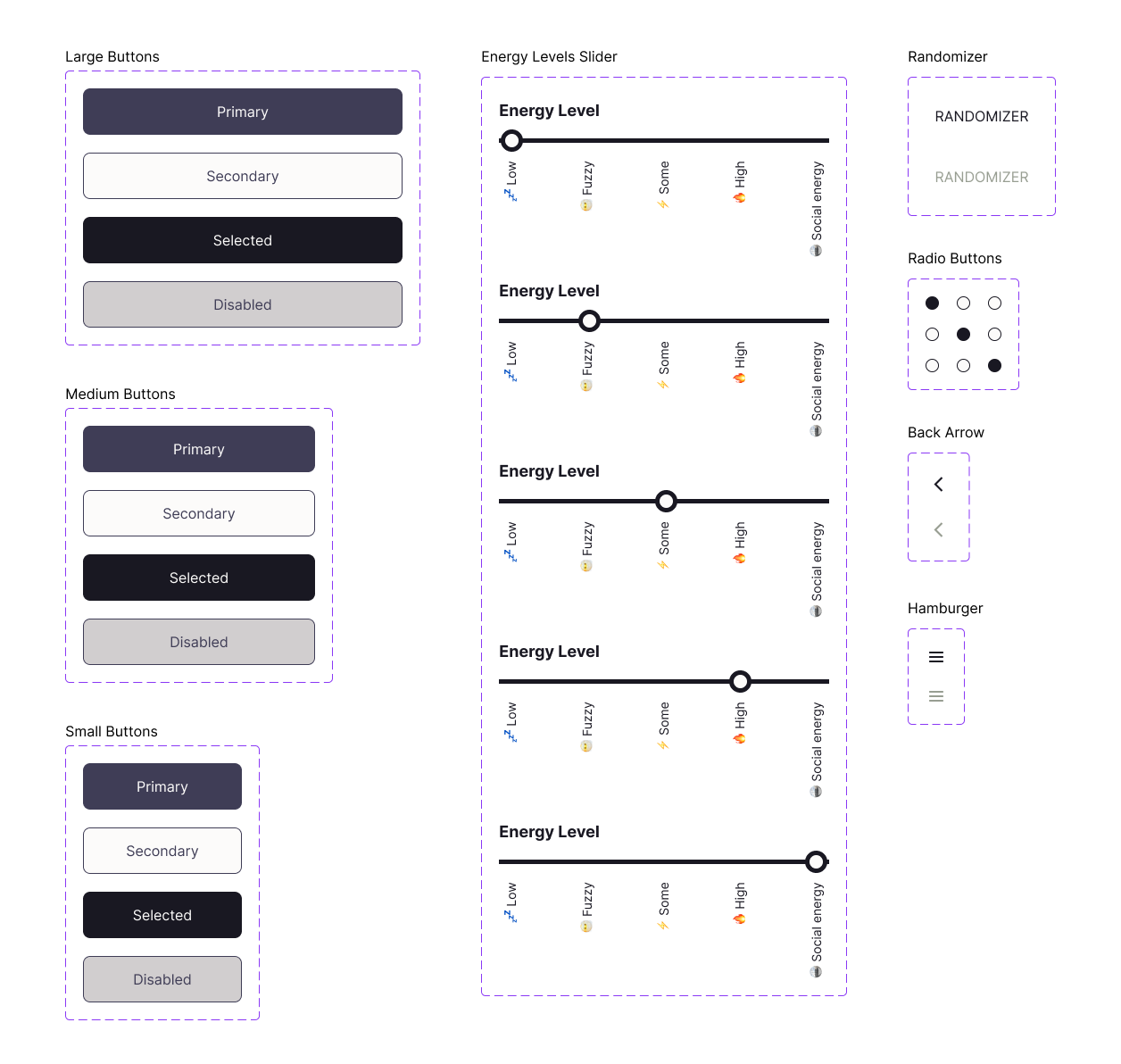
UI Kit
UI Kit
UI & Visual Design
UI & Visual Design
The final design for Indigo reflects multiple rounds of visual exploration and iteration, guided by the brand’s core values: calm, approachable, and subtly playful. The UI needed to feel light and low-pressure, mirroring the app’s promise to reduce decision fatigue, while also encouraging small moments of joy through illustration and copy.
Key Visual Decisions
Minimalist Layouts - Screens prioritize a single focal action at a time (e.g., “Get Started,” “Give me my prompt”), reducing cognitive load and guiding the user flow intuitively.
Soft Gradients & Muted Palette - Color gradients in lavender and slate tones convey calmness and evening ambience, aligning with Indigo’s “evenings, reimagined” positioning.
Playful Illustrations - Friendly, whimsical characters appear sparingly to punctuate key moments, like completing a task or encountering an empty state. This prevents visual fatigue while reinforcing the brand’s warmth.
Generous Negative Space - Ensures content feels breathable and avoids overwhelming the user.

Hifi Mockups
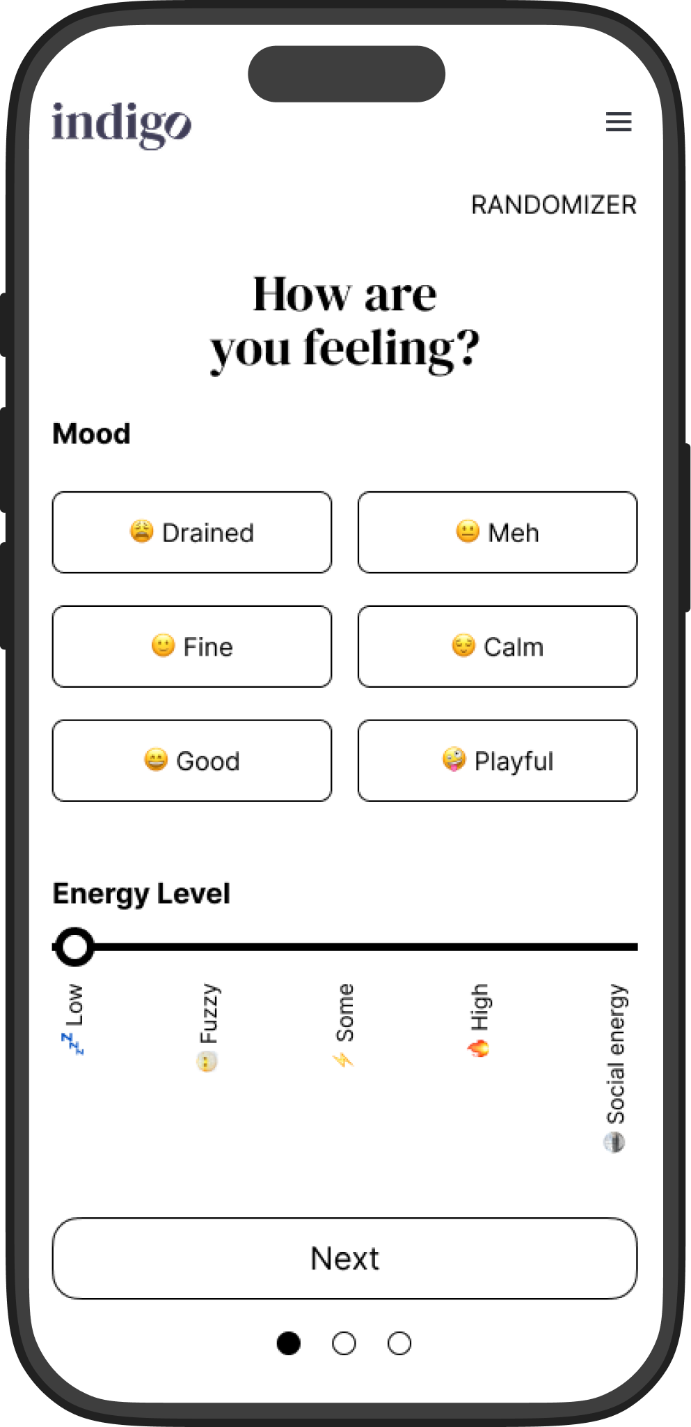
How are you feeling today?


Prompt
Empty State & Randomizer Screens

Prototype

How are you feeling?
Homepage
Wants for tonight
No-gos?
Prompt
Push notification
Completion quote
That’s it for today
Empty state screen
Randomizer
Deeper Dive on Key Screens
Mood & Energy Check-in
Two simple sliders and a small set of mood buttons allow for quick personalization without overthinking.
Labels are casual (“Drained,” “Playful”), avoiding clinical or overly formal language.
The horizontal energy slider visually reinforces the concept of “low to high” in a tactile way.
Prompt Screen
Prominent, center-aligned prompt text ensures the activity suggestion is the clear hero.
The “I did it!” button is intentionally large and celebratory, making the completion action rewarding and visible.
Small illustration adds lightness and encourages engagement without distracting from the prompt.
Empty & Randomizer States
Both use illustration and short, friendly copy to avoid a “dead-end” feeling.
The “Surprise me” button is framed as an inviting alternative rather than a fallback, helping indecisive users continue exploring.
Usability Testing
Usability Test Objective
The objective was to validate emotional usability and flow clarity, specifically:
Could users complete the experience with no confusion or frustration?
Did the experience feel grounding, light, and emotionally safe?
Would users feel motivated to return or recommend it?
Wireframe Testing (Maze)
Participants: 5
Tasks: Input mood, receive prompt, complete task, try randomizer
100% task completion
80% described flow as intuitive
60% said they’d use regularly
High-Fidelity Testing (Maze)
Participants: 5
Tasks included same flows as wireframe test
100% preferred randomizer when tired
90% wanted to use app multiple times weekly
Feedback Highlights:
“I loved that it asked how I felt first.”
“The surprise prompt made me laugh and feel lighter.”
“I didn’t feel judged - it was just a gentle nudge.”
Testing both wireframes and high-fidelity mockups in Maze allowed me to validate:
The value of one daily prompt (not too little, not too much)
The appeal of the randomizer (especially for users low on energy)
Whether users understood what to do next on each screen
Whether visual hierarchy and tone matched the product’s goal
Quantitatively, I saw 100% task completion across both tests, and high satisfaction. Qualitatively, users responded positively to the gentle tone, visual clarity, and “non-demanding” design.

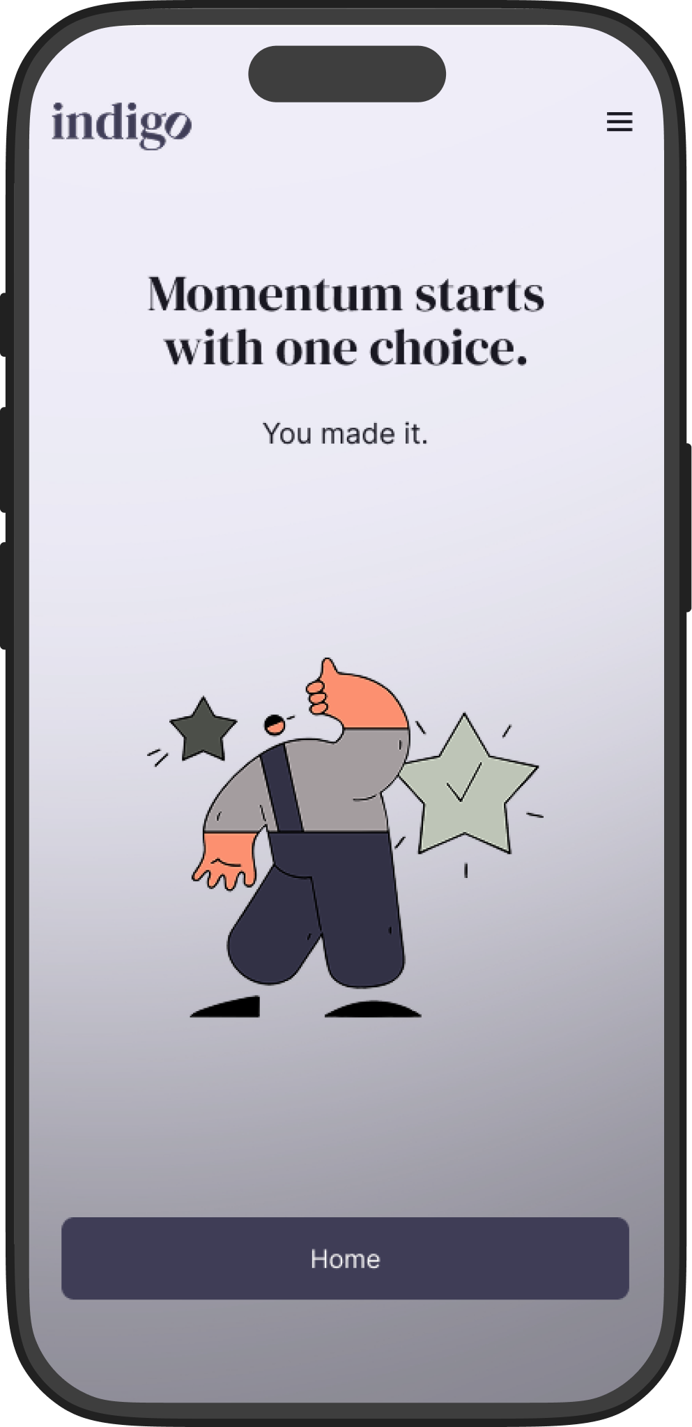
Final Thoughts
Indigo is about reclaiming the hours after work - not through productivity, but through presence. It invites users to feel something, even if just for a moment.
Impact & Lessons Learned
What Worked:
Designing for feelings resulted in higher emotional connection
Prioritizing low effort = higher engagement in testing
Building in delight and affirmation led to repeat desire
Challenges:
Balancing simplicity with user agency
Ensuring screen reduction didn’t feel limiting
Designing for emotional tone without overstepping
Lessons Learned:
Emotional UX is powerful when paired with clarity
Testing even “simple” flows uncovers usability wins
Delight is both strategy and outcome
Next Steps:
Expand prompt library by season, location, or intention
Explore light journaling and streak tracking
Add social discovery without increasing screen time