
Designing a smarter dashboard to power volunteer management.
Creative Justice is a Seattle-based arts program that works with court-involved youth, using creativity as a pathway toward personal growth and community healing. Our project focused on designing a new internal dashboard to help the team track projects, participant engagement, and impact metrics more efficiently. While not an end-to-end product build, this project applied a research-driven design approach to solve key pain points in navigation, usability, and data visibility.
Project Overview


Project Goal:
The goal was to design a Creative Justice dashboard to streamline event management with volunteers in a visually clear, easy-to-use tool that allows staff to:
Quickly access participant and event data - so staff can respond to volunteer needs and changes in real time.
Track volunteer milestones - to recognize contributions, improve retention, and plan future engagement.
View key impact metrics at a glance - helping the team report progress to stakeholders and secure continued support.
Reduce friction in updating and finding information - enabling the small, time-strapped nonprofit team to focus more on community work and less on administrative tasks.
The deeper challenge was ensuring the dashboard worked for a small nonprofit without adding complexity. The design needed to be intuitive enough for quick adoption, while also flexible enough to grow with the organization’s evolving needs.
My Role:
Served as the sole UX/UI designer, leading the project from initial concept to final prototype. Conducted user interviews with volunteers and nonprofit staff in similar roles to understand event management challenges and common dashboard pain points. Defined and prioritized features that would help a small, time-strapped nonprofit team work faster with less cognitive load. Designed a clean, intuitive dashboard in Figma with a clear visual hierarchy for quick navigation. Incorporated usability testing feedback to refine layout, labeling, and accessibility for quick adoption.
Tools:
Figma, Google Meet, Maze
The Problem
Without access to Creative Justice’s internal dashboard, I gathered insights by interviewing five participants with experience using admin dashboard tools. Their feedback highlighted common challenges: scattered information, unclear navigation, and data that wasn’t easy to access or interpret quickly. These pain points often led to inefficient workflows and made it harder for organizations to track and communicate their impact effectively.
The Solution
The redesigned dashboard organizes core functions into a single, easy-to-scan view:
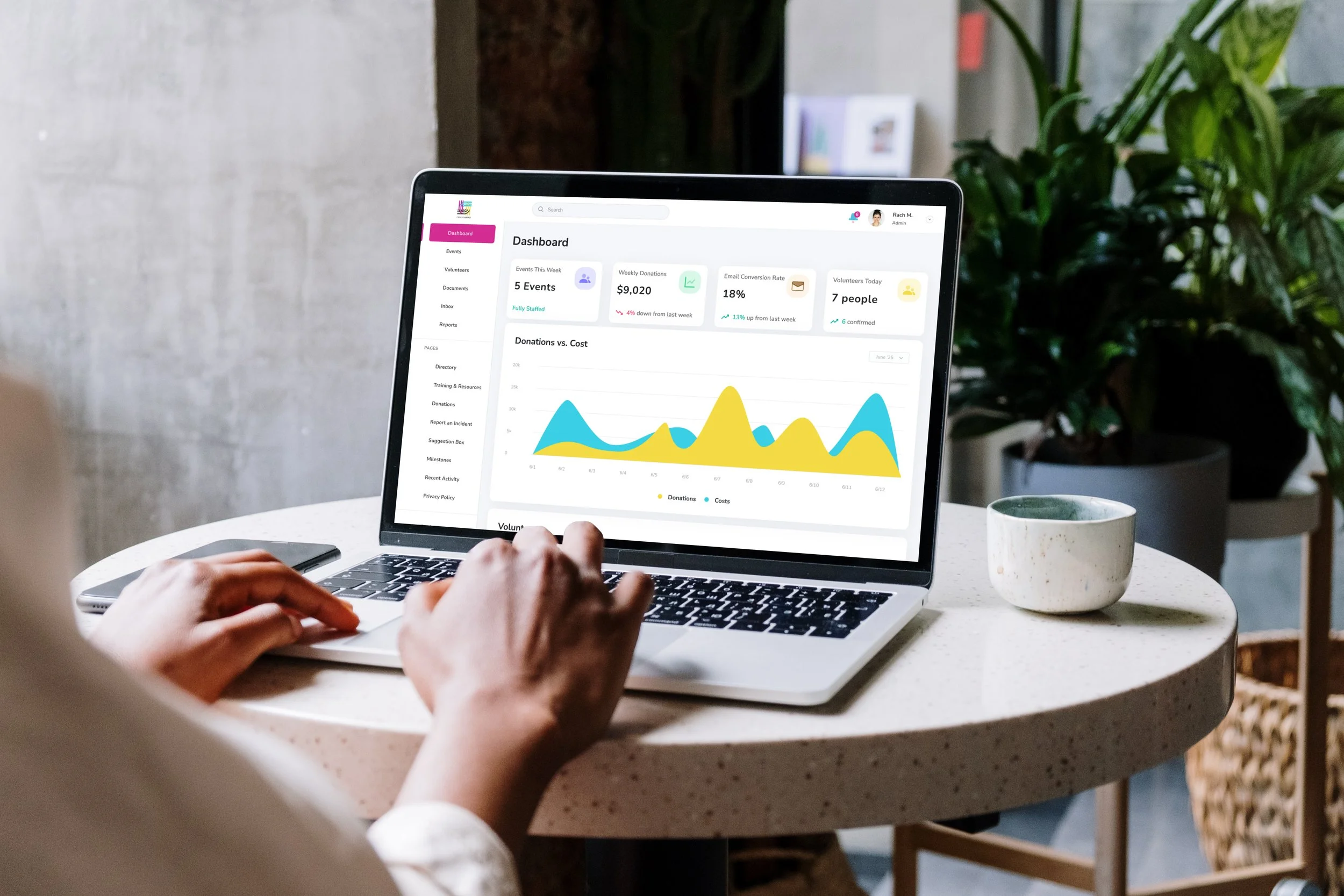
At-a-Glance Metrics: Quick stats on participants, current projects, and overall impact.
Streamlined Navigation: Clear labeling and iconography for faster access to the most-used sections.
Visual Clarity: Color coding and section grouping for instant recognition of different data types.
Scalability: Layout and architecture designed to accommodate future growth in features or data sources.
The result is a dashboard that saves time, reduces mental strain, and helps the Creative Justice team better communicate their impact.
Research
User Interviews
To better understand dashboard usability needs, I interviewed five participants with prior experience using admin dashboard tools across various industries. The goal was to identify universal pain points and opportunities that could inform Creative Justice’s redesigned dashboard.
Key Questions Included:
What’s the most frustrating part of using dashboards you’ve worked with?
Which features or tools do you use most frequently?
What information is most important for you to see immediately after logging in?
Key Insights:
Prioritize Key Data: Users want the most relevant metrics visible at a glance, without unnecessary clicks.
Clarity in Navigation: Confusing menus, unclear labeling, and inconsistent layouts slow down workflows.
Visual Hierarchy Improves Efficiency: Clear grouping, color coding, and icons help users scan and find what they need faster.
Low Learning Curve Is Crucial: A dashboard should be intuitive enough to learn in minutes, not hours, especially for new team members.
Customization Helps Adoption: The ability to tailor the display to personal workflow preferences makes dashboards feel more valuable.
Affinity Map Debrief
Key Themes and Insights:
Workflow Efficiency & Process Improvements
Users consistently highlighted a need to streamline their workflows, reduce repetitive manual tasks, and improve overall process efficiency. Any new dashboard design should prioritize automation where possible and minimize clicks to complete routine tasks.
Accessibility & Usability
Accessibility emerged as a vital consideration, with attention given to screen reader compatibility, clear and consistent navigation, and readable visual design.
Visibility & Clarity of Information
There is a strong desire for at-a-glance visibility into volunteer availability, event status, and program impact metrics. Users want dashboards that provide quick, clear insights without overwhelming clutter.
User Customization & Preferences
Several notes pointed to the importance of allowing users to customize views and notification preferences, so each user can tailor the dashboard experience to their specific role or workflow.
Communication & Coordination
Effective communication between volunteers and staff is critical. Features such as easy contact information access, reminders, and notifications for upcoming events or changes were suggested to reduce no-shows and improve engagement.
Data Management & Integrity
Users expressed concern about ensuring the accuracy and up-to-date status of volunteer records and event data. Simplified data entry forms, clear error handling and validation were seen as important to maintain data integrity.
Training & Onboarding
Given the anticipated variability in staff familiarity with technology, easy onboarding with tutorials or contextual help was flagged as essential to lower the learning curve and reduce support requests.
Summary
The affinity map reveals a comprehensive picture of user expectations focused on efficiency, clarity, and flexibility. Designing the Creative Justice dashboard around these principles not only improved daily workflows but also empowered staff to better manage volunteers and demonstrate program impact. Special attention to accessibility and onboarding will ensure the tool is inclusive and easy to adopt.
This structured insight serves as a critical foundation for prioritizing features and design decisions in the dashboard development process.
Persona Highlight


Competitive Audit
To better understand the landscape of nonprofit-focused dashboards, I reviewed four tools commonly used for donor and volunteer management: Kindful, Givebutter, DonorPerfect, and Keela. The goal was to identify strengths we could draw from and gaps we could address in the Creative Justice design.
-
Strengths:
Clean layout, strong donor tracking features, and robust reporting tools.
Weaknesses:
Volunteer management tools are limited; some features feel buried within menus.
Takeaways:
Strong at organizing donor data, but lacks the streamlined volunteer management focus Creative Justice needs.
-
Strengths:
Highly user-friendly, visually engaging campaign pages, and strong fundraising integrations.
Weaknesses:
More geared toward public-facing donation campaigns than internal data management.
Takeaways:
Great for storytelling and donor engagement, but not optimized for daily internal workflows.
-
Strengths:
Comprehensive donor database, customizable reporting, and advanced segmentation.
Weaknesses:
Can feel overwhelming; steep learning curve for new users.
Takeaways:
Feature-rich, but requires more training time than Creative Justice’s small team can realistically support.
-
Strengths:
Balanced approach to donor, volunteer, and campaign management with clear navigation.
Weaknesses:
Interface can feel slightly dated; some users report slower load times.
Takeaways:
Offers the most well-rounded toolset, but still leaves room for a cleaner, more tailored volunteer dashboard experience.
Opportunity Identified:
Most platforms focus heavily on donor management, with volunteer tracking often treated as an add-on rather than a core feature. Creative Justice’s dashboard design addresses this gap by prioritizing volunteer coordination and impact tracking in an intuitive, visually clear interface.
User Flow

The main objective of mapping the user flow for the Creative Justice dashboard was to design the most intuitive path for assigning volunteers to events - one of the most frequent and high-impact administrative tasks for the organization.
This mapping exercise focused on:
Minimizing clicks to complete the assignment process
Keeping navigation predictable with clear section labels
Ensuring visibility of both event details and volunteer availability during selection
Providing confirmation once the task was completed successfully
The clarity of this single, targeted flow informed my low-fidelity wireframes by ensuring each screen served a specific purpose, navigation stayed forward-moving, and high-priority actions like “Assign Volunteers” were easily accessible.
Lowfi Wireframes
Homepage

Dashboard Homepage

Volunteer Availability

Volunteer Directory

Volunteer Contact

Volunteer Contact Successful

Login Screen

Upcoming Event

Design Evolution
Wireframes
I began with low-fidelity wireframes focusing on information hierarchy and navigation clarity. The early designs prioritized:
Large, clearly labeled navigation buttons for core areas (Volunteers, Events, etc.)
Color-coded sections for quick visual scanning
Minimal on-screen clutter to make key metrics stand out
Early feedback from participants showed a need for:
More visual grouping to help users quickly identify related data
Persistent navigation so users could jump between tasks without backtracking
Clearer terminology to avoid confusion for first-time users
High-Fidelity Designs
Moving into high-fidelity, I established a visual identity that felt organized yet approachable, using:
A clean, high-contrast palette for legibility
An easy to use directory to find volunteers efficiently
Intuitive side bar for easy navigation
Breadcrumbs so users can backtrack as needed
Final features included:
At-a-glance metrics for volunteers, active projects, and impact milestones
Quick-action buttons for viewing events and adding volunteers
Search and filter tools for navigating volunteer and project records efficiently
Revisions
The revisions from the low-fidelity mockup to the high-fidelity prototype focused heavily on improving usability and visual clarity based on user feedback.
One key change was how volunteer availability was input. Initially, the low-fi design featured a long-running checkbox system where users had to manually select availability across numerous options. This approach proved cumbersome and overwhelming. To address this, I redesigned the interface to use a concise dropdown menu positioned prominently at the top of the page. This dropdown allows users to quickly select volunteer availability in a more streamlined, intuitive manner. This change not only simplified the interaction but also made the design cleaner and more visually appealing.
Additionally, the dashboard landing page was simplified significantly from the low-fi version to the final high-fi prototype. Early designs presented a denser, more complex layout that, while comprehensive, overwhelmed users and did not align well with their primary needs. Based on user testing insights, I pared down the dashboard to highlight the most relevant information and actions, prioritizing clarity and ease of navigation. This refinement ensured that users could quickly grasp the dashboard’s purpose and perform key tasks with less cognitive load, ultimately creating a more effective and user-centered experience.
Visual Design & Visual Consistency
Visual identity approach:
Brand accent (magenta) used for CTAs, highlights, and status - paired with neutral surfaces to keep focus on data.
Rounded shapes & generous spacing to maintain a friendly, human feel.
Clear hierarchy via consistent type scale, spacing, and color.
Key screens:
Dashboard Overview - KPI cards, donation chart, and recent volunteer table for a quick operational snapshot.
Events - List view for scanning details at a glance; single-column detail page for easy reading and action.
Volunteers Directory - Table with filters and search, profile modal for context, and a streamlined contact → confirmation flow.
Design rationale:
Prioritized legibility and efficiency for daily use.
Standardized interaction patterns (e.g., modals for details) to reduce cognitive load.
Ensured accessibility with high contrast, visible focus states, and color-independent status indicators.
The final system balances Creative Justice’s energy with operational clarity, making it scalable for new features while staying true to the brand.
Hifi Mockups
Homepage

Dashboard Homepage

Upcoming Events

Volunteer Directory Page: Filter Results

Volunteer Directory Page: Volunteer Details

Volunteer Directory Page: Volunteer Contact

Login Screen

Events Landing Page

Volunteer Directory Page

Volunteer Directory Page: Contact Successful

Usability Testing
Usability Test Objective
The primary user flow we tested was “Assign Volunteers to Event.” This flow was chosen because it’s a critical recurring task for admin dashboard users and offered a clear opportunity to assess navigation, clarity, and efficiency. Through usability testing, participants were asked to locate an event, view its details, and assign volunteers from the available list.
Feedback revealed that while participants could ultimately complete the task, some hesitated when switching between the event list and volunteer profiles, suggesting the need for clearer action prompts and a more streamlined assignment process.
Wireframe Testing (Maze)
Participants: 6
Tasks: Mid-fidelity dashboard wireframes focused on volunteer management, event navigation, and admin communication
100% successfully logged into the dashboard
100% navigated to view the events
66.7% were able to filter the volunteers and contact Casey.
What Needs Improvement
Volunteer task caused most confusion: Only 66.7% completed the task successfully.
Users struggled to understand how to:
Select a volunteer
Exit a profile view without sending a message
Confirm whether the contact task was complete
Exit logic unclear: One user noted that they had to send a message to exit a profile, creating friction
Misclick rates high (especially on volunteer task): Likely due to either unclear tap targets or overlapping functionality (e.g., cards vs. dropdowns).
High-Fidelity Testing (Maze)
Participants: 5
Same tasks as wireframe testing
100% task completion for all tasks
Feedback Highlights:
100% of users said the dashboard was easy to navigate.
Next Steps / Iteration Plan
Revise filter UX:
Label filters more clearly
Update event layout:
Move event title above banner image
Improve header hierarchy for event cards
Improve login UI clarity
Consider login CTA placement and icon clarity
Validated through testing:
Testing both low- and high-fidelity versions confirmed:
The importance of persistent navigation
The value of visual grouping and consistent labeling
That reducing clutter improved speed and accuracy in task completion
Final Thoughts
This project demonstrated how focused, user-centered design can improve critical workflows in nonprofit administration, even when working with limited direct access to existing systems. By zeroing in on the volunteer assignment flow, we identified key usability improvements that reduce friction and save valuable staff time.
The research-driven design approach ensured the dashboard meets real user needs around clarity, efficiency, and scalability, setting the foundation for future growth and expanded features.
Ultimately, this project underscores the power of thoughtful UX in supporting mission-driven organizations to better coordinate volunteers and amplify their impact.
Impact & Lessons Learned
What Worked:
Prioritizing most-used features increased efficiency and reduced cognitive load
Visual hierarchy and color coding improved scan-ability
Consistent navigation kept users oriented throughout tasks
Challenges:
Designing for a specific organization without direct access to their current system required broader pattern testing and assumption validation
Balancing simplicity with future scalability in case Creative Justice’s needs grow
Lessons Learned:
Even without direct access to an organization’s system, targeted user testing can uncover universal usability improvements for admin tools
Small interface changes (like persistent navigation) can have outsized impacts on efficiency
Designing for clarity first ensures scalability later
Next Steps:
Consider functionality for customizable dashboards so each team member can see their most relevant data first
Explore mobile-responsive layouts for staff who need to access the dashboard in the field