Inclusive Event Discovery Made Simple
This mobile-first project, Out and About, is designed to help queer folks connect through shared experiences, not just social media. From early research and persona development to wireframes and usability testing, the project followed a lean, iterative process that prioritized trust, safety, and genuine connection.
Project Overview

Project Goal:
Out and About is a mobile-first website designed to help queer people discover inclusive, interest-based events, without relying on traditional social apps or enduring awkward small talk. The real challenge wasn’t just surfacing events; it was creating a product that felt emotionally safe, community-driven, and aligned with how queer people actually want to connect.
Users weren’t looking for another social media feed or hookup app - they were craving a low-pressure, affirming way to find “their people” through shared activities. The deeper challenge was creating a product that prioritized trust, ease, and choice, while avoiding overwhelming users with options or placing the burden on them to constantly initiate interaction.
This required a careful balance between functionality and emotional intelligence, designing a product that felt warm, intentional, and intuitive.
My Role:
I led the Out and About project as the sole UX/UI designer, guiding the entire process, from research and strategy to design, testing, and iteration. I conducted interviews, created personas, mapped task flows, designed wireframes and a visual identity, and refined the product through usability testing. This work deepened my skills in designing for inclusion, trust, and nuance, with a focus on emotional UX over flashy UI.
Tools:
Figma, Google Meet
The Problem
Queer individuals often struggle to find events that feel inclusive, safe, and reflective of their identities, especially when relying on mainstream platforms that don’t prioritize community or accessibility. The most significant problem I set out to solve was:
The goal was to design a platform that makes it easy to find, vet, and attend events that align with users' values and identities, without the overwhelm, friction, or uncertainty often experienced on other platforms.
The Solution
To address the need for an inclusive and intuitive event discovery experience, I designed a mobile-first platform that empowers queer users to find local events with confidence and ease. The design prioritized accessibility, transparency, and trust - surfacing key event details at a glance and streamlining the RSVP flow to reduce friction.
Key features included a clean, approachable UI, robust event filtering, and consistent navigation patterns to build trust and usability.
Research
User Interviews
I conducted 5 in-depth interviews with queer-identifying people aged 25 - 39 who wanted more community connection but felt fatigued by traditional social apps. Interviews focused on:
How they currently discover and attend events
Emotional and logistical barriers to meeting new people
Feelings about queer spaces, digital safety and social energy
Key Questions Included:
How do you usually hear about events or meetups in your city?
What makes you feel excited or hesitant about going to something new?
What role do queer spaces play in your social life?
What’s missing from your current way of connecting with community?
Key Insights
Safety and comfort come first
Participants emphasized the emotional labor of “putting themselves out there” and the need for safe, low-pressure spaces to connect.People want connection, not networking
There’s a strong desire for casual, shared-interest events where people can connect organically.No one wants to scroll more
Participants were frustrated with how social discovery was often tied to screen-heavy, gamified platforms or overwhelming group chats.Clear, low-lift options win
Ambiguity or lack of event context was a major blocker. People wanted to know what to expect, who it’s for, and if it’s worth showing up.These insights directly influenced the event filtering logic, copy tone, and overall UX of the project.
Quantitative Highlights
100% of participants expressed fatigue with current discovery platforms when trying to find events.
80% said they were more likely to attend an event if it had a clear vibe, description and was interest-based.
60% reported avoiding events because of social overwhelm or uncertainty about who the space was “for.”
4 out of 5 participants mentioned they would attend more events if there were fewer barriers to finding ones that matched their energy or interests.
Affinity Map Debrief
Event Discovery:
Social media platforms like Instagram dominate as tools for finding queer events.
Word-of-mouth recommendations remain significant, especially within local queer communities.
Platforms like Meetup are less favored due to paywalls and perceived limitations in inclusivity.
Motivations for Attending Events:
Building community and expanding social circles are central reasons for attending queer events.
Many view these events as alternatives to dating apps for meeting potential partners.
Participants also seek personal growth, self-expression, and a sense of belonging.
Positive Experiences:
Participants value low-pressure, diverse events that aren’t just meeting up in a bar.
Inclusive and creative environments foster comfort, safety, and individuality.
Supportive atmospheres help participants feel actively welcomed and included.
Challenges and Barriers:
Safety concerns arise around venue selection, especially for marginalized attendees like trans individuals.
Costs, including high entry fees and parking expenses, limit access for some.
Expectations for Events:
Attendees prioritize affordability, accessibility (e.g., physical accommodations,
scent sensitivities), and diverse formats.
Intersectionality is critical: spaces must welcome trans individuals, people of
color, and others with intersecting identities.
Learnings/Guesses About What This Data Might Mean
Inclusive Design is Critical: Queer events succeed when they intentionally cater to diverse identities and needs, addressing safety, accessibility, and representation.
Centralized Platforms Are Needed: With social media as the dominant discovery tool, a cohesive, centralized platform for queer events could fill a significant gap.
Diverse Formats Matter: Moving beyond bar-centric events to include sober, creative, and activity-based gatherings increases inclusivity and appeal.
A Problem to Solve Moving Forward
How might we create a centralized, inclusive, and accessible platform that consistently connects queer individuals to a diverse range of events, while addressing safety, affordability, and intersectionality?
This question will guide the next stages of exploration, focusing on solutions that empower organizers and attendees while building stronger queer communities.
Persona Highlights


Competitive Audit
To better understand the landscape of event discovery platforms, I conducted a competitive audit of four apps, including Lex, Meetup, Eventbrite and Facebook Events. I focused on evaluating features, accessibility, inclusivity, user flows, and visual design. This audit revealed gaps in personalized experiences for queer communities, lack of trust indicators, and inconsistent RSVP processes. These insights directly informed design decisions for Out and About, helping to differentiate the platform through a more intentional, community-centered, and user-friendly approach.

User Flow
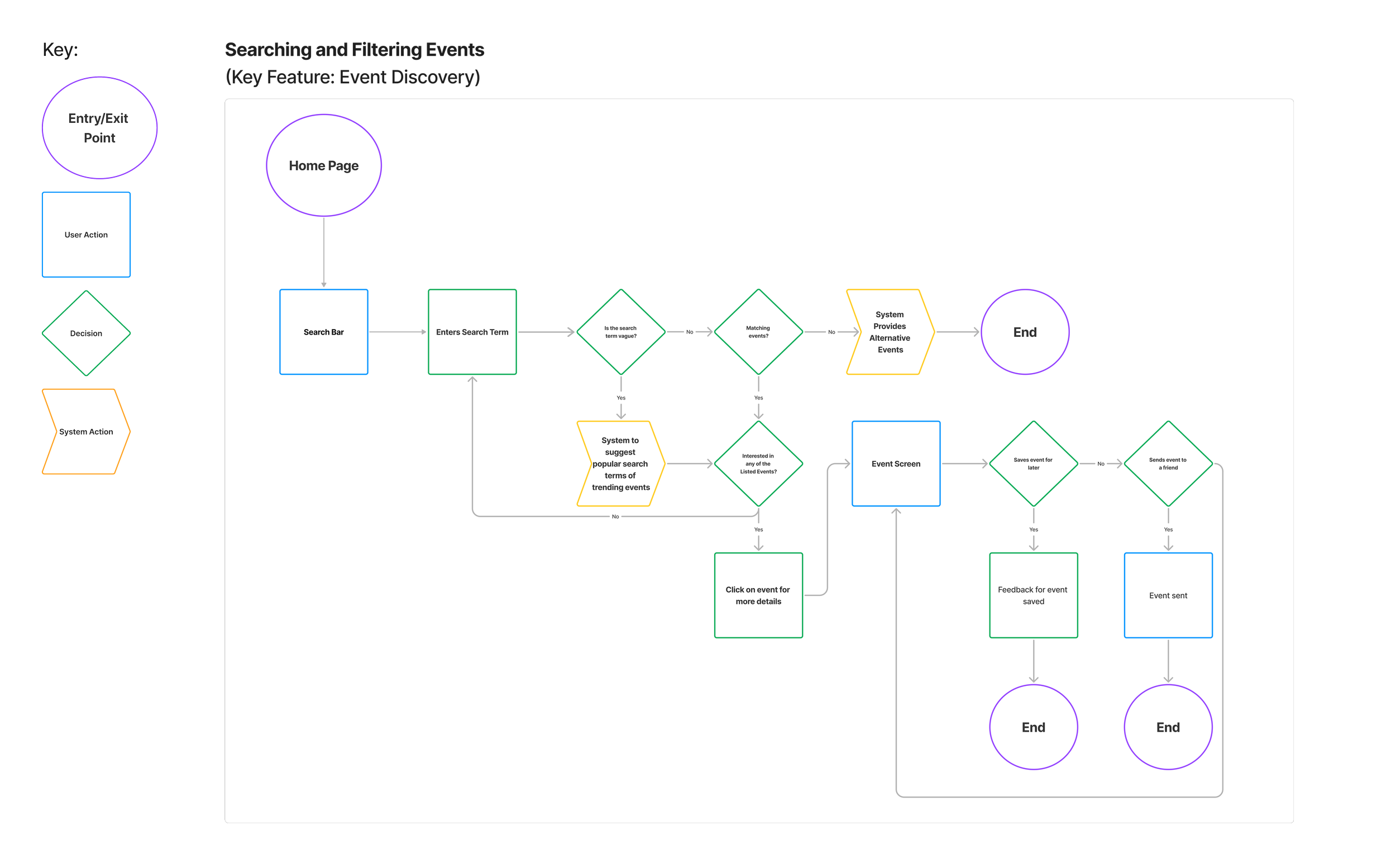
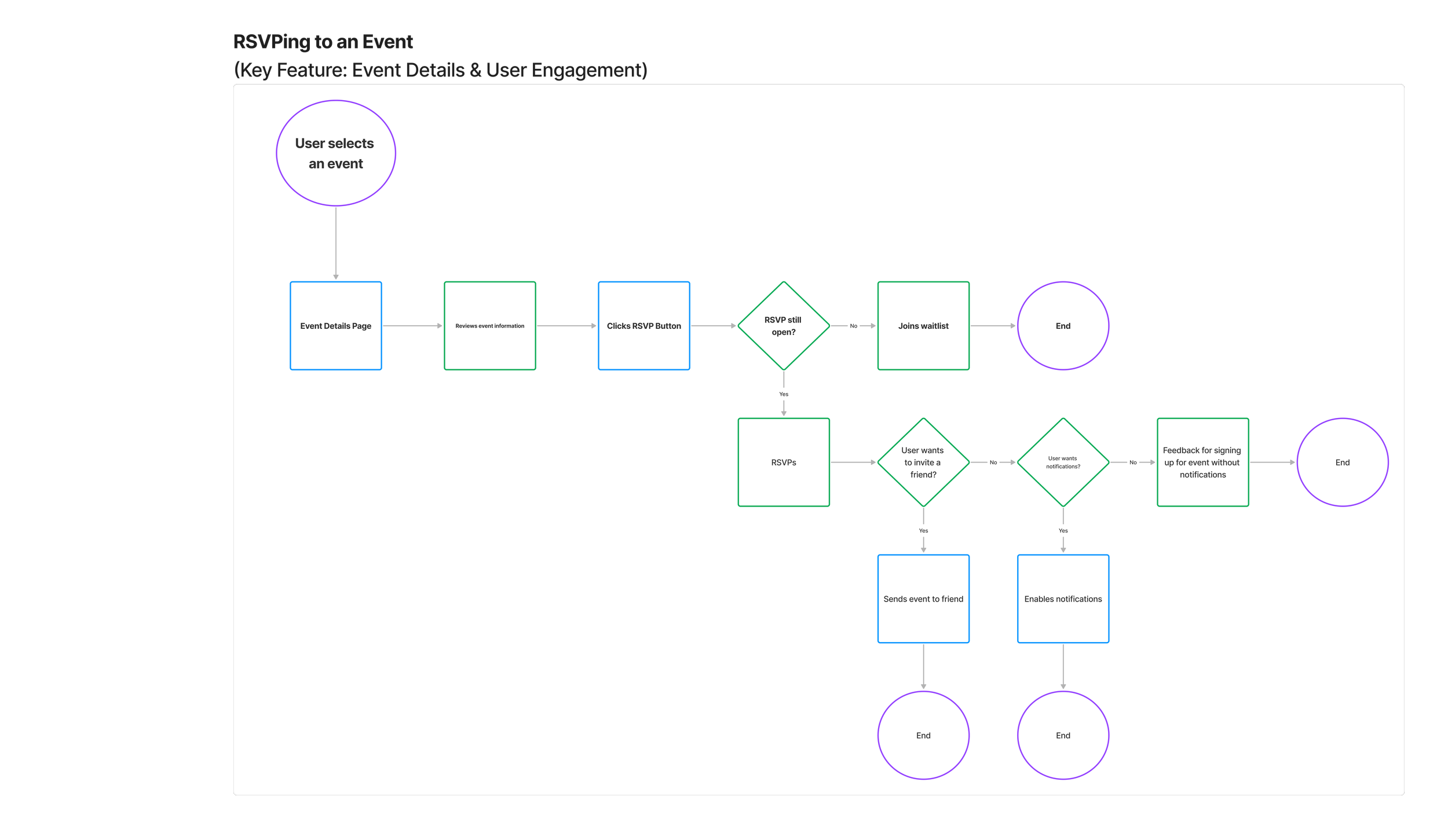
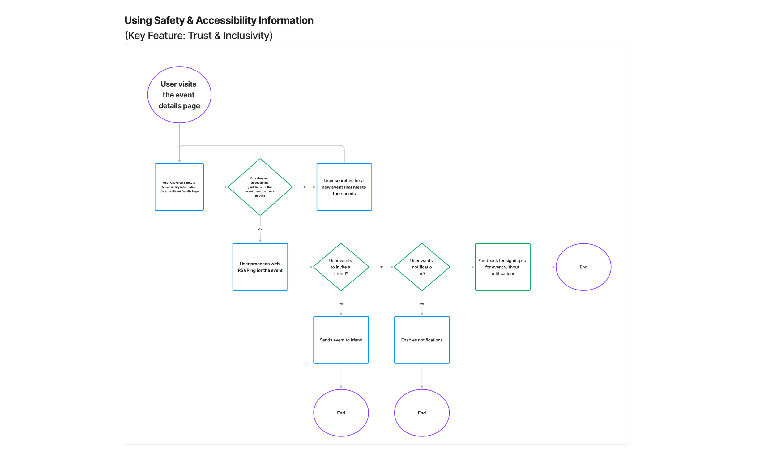
Why user flows?
Creating user flows helped me visualize the complete path a user takes when searching for, filtering, and RSVPing to events. They also helped me consider additional screens for both happy paths and alternate paths.
What did they allow me to do?
They clarified key decision points, highlighted opportunities to reduce friction, and ensured each step felt intuitive, inclusive, and aligned with user goals - ultimately shaping a smoother, more trustworthy event experience.
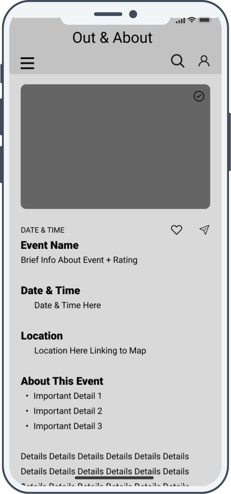
Lowfi Wireframes
Homescreen

Search

Event details
Searching with filters

RSVP

Search results with filters

RSVP confirmation

Design Evolution
Wireframes
Established the basic layout and structure, ensuring an intuitive user flow before adding visuals.
Focused on refining content placement and interaction points while maintaining a grayscale, distraction-free design.
User Testing & Feedback of Mid-Fidelity Screens
Conducted usability tests with mid-fidelity designs to validate user flows and identify usability pain points.
High-Fidelity Designs
Applied typography, color theory, and a consistent component system to branded screens. Accessibility improvements were implemented based on insights.
Revisions & Refinements
Throughout the design process, multiple adjustments were made to improve usability, accessibility, and visual clarity, ensuring the app not only looked aligned with the brand but also functioned seamlessly in real-world use.
Removed Magnifying Glass for Clarity
The search bar originally included a magnifying glass icon, but user feedback suggested it was visually redundant given the “Find Events” button. Removing it simplified the header and reduced visual noise.

Added Gradient to Hero Image
To improve text readability and color contrast for accessibility, a subtle gradient overlay was added behind the hero headline. This ensures the tagline remains legible regardless of the underlying image.
Adjusted Heart Icon Visibility
The save/favorite heart icon was refined to have stronger contrast and clearer outlines, making it easier to spot and understand at a glance.
Widened Dropdown Menu
The mobile navigation dropdown was widened to prevent text wrapping and truncation, improving both legibility and touch target size.
These revisions, though subtle in isolation, collectively elevated the app’s usability and perceived quality. They also demonstrate how iterative adjustments based on accessibility, visual hierarchy, and interaction feedback can significantly improve the final user experience.
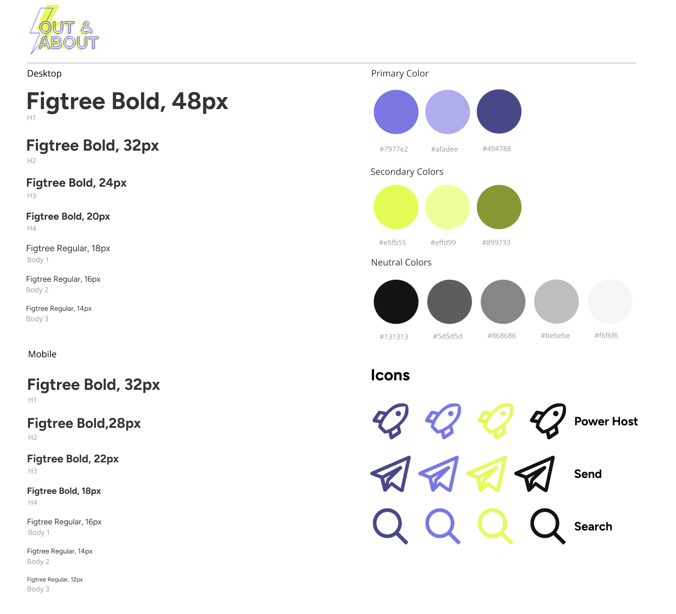
Style Guide
Style Guide
UI & Visual Design
UI & Visual Design
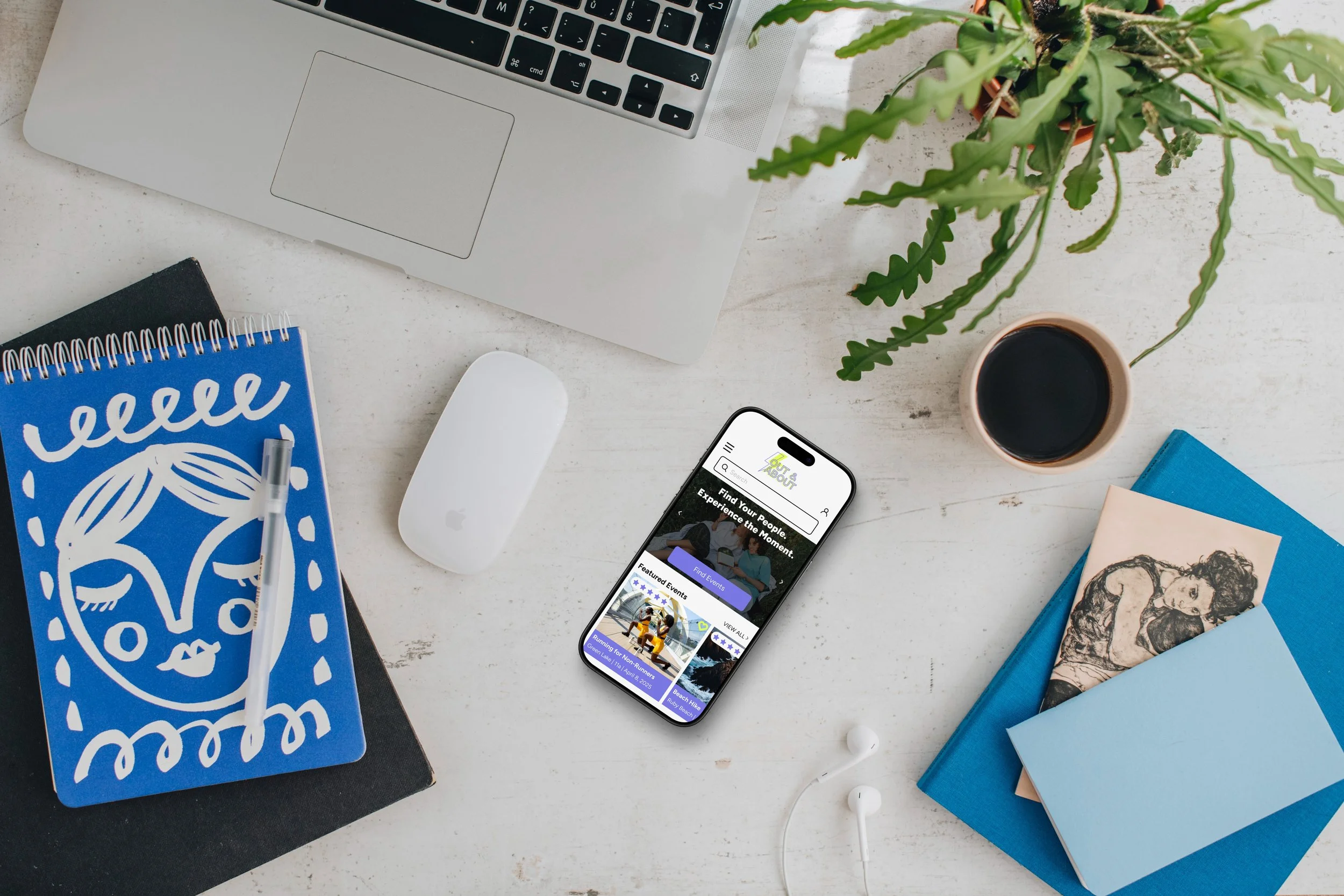
The final design for Out & About demonstrates a cohesive application of branding, typography, and color theory to create an approachable yet energetic event-discovery experience. The visual language builds directly from the style tile, incorporating Figtree typography in a clear hierarchy, a vibrant primary palette centered on purples, and secondary neon greens for energy and emphasis.
The design balances playfulness (through bold colors and lively iconography) with clarity (generous whitespace, clean layout, and consistent spacing). This ensures the app feels both exciting for social events and usable for quick searches and RSVPs.
Key Screen Highlights
Homepage
Hero Section:
Large, inviting hero text (“Find Your People. Experience the Moment.”) uses Figtree Bold to immediately set the tone and brand personality.
Event Carousels:
Horizontal scrolls for “Featured Events” and “Trending in Seattle” provide visual variety while showcasing imagery. The event cards’ consistent use of purple labels and rating icons tie them back to the brand palette.
Brand Reinforcement:
Logo placement and footer styling keep the neon-accent identity consistent without overwhelming the interface.
Search & Filtering
Search Results Screen:
Cards display event title, date, and category tag in a structured hierarchy. The purple category ribbon aligns with the primary color palette, ensuring quick scannability.
Filter Drawer:
Long form filter options are structured into labeled categories (Event Type, Demographic Focus, Accessibility Options, etc.) with clear checkboxes, providing function without visual clutter. Neutral gray tones keep the filter panel visually secondary to the event imagery.
Event Details & RSVP Flow
Event Details:
Minimal layout keeps focus on the event’s name, date/time, and imagery. The RSVP button uses a solid primary purple for strong call-to-action visibility.
RSVP Form:
Inputs are cleanly spaced with a straightforward vertical flow, reinforcing usability. Minimal color distractions here help users focus on completing the form.
Confirmation Screen:
The success state maintains brand consistency while reducing visual noise, making the “View Profile” button stand out.
Design Rationale & Iteration Thought Process
The design evolved from early explorations into a balanced expression of vibrancy and usability:
Brand Integration: The primary purples and secondary neon greens were strategically placed - purples for structure and CTAs, neon greens for accent icons and status indicators. This creates a visual rhythm and avoids color fatigue.
Hierarchy & Legibility: The Figtree type family was used at distinct sizes to clearly differentiate H1–H4, body text, and captions across desktop and mobile, aligning with the style tile specs.
Iconography: Custom icon styles from the style tile were consistently applied, for example, the “Send” and “Search” icons retain their outlined bold look, matching the playful yet structured brand tone.
Imagery Use: Event cards rely on strong imagery for emotional connection, but are overlaid with semi-transparent color tags to maintain brand identity and improve text contrast.
Interaction Feedback: States such as “Saved Event” use the neon green heart icon to signal completion and bring personality to micro-interactions.
The final UI reflects a well-integrated brand system - energetic yet approachable, highly visual but grounded in strong typographic and spatial hierarchy. Through iterative adjustments, the design balances excitement for discovery with clarity for action, ensuring the app both engages users emotionally and guides them effectively through the event-finding and RSVP process.
Hifi Mockups
Home Screen

Find Events Using Filters


Event Details & RSVPing


Usability Testing
Usability Test Objective
For this usability test, 5 participants were interviewed using a mix of in-person and remote (Google Meet) moderated testing. The primary goal was to evaluate:
Event Search & Filtering: Can users easily find relevant events using search and filters?
RSVP Process: Is the RSVP process intuitive and accessible?
Overall Usability & Accessibility: Does the platform meet expectations for navigation, design clarity, and inclusivity?
The Results
Navigation was intuitive: All users said the site felt natural and easy to use, comparing it to familiar event discovery platforms.
Filtering system was highly effective: Users loved the ability to refine searches by demographics, vibe, and accessibility.
Trust-building elements were strong: Seeing host photos, past events, and reviews made participants more confident in event legitimacy.
Design felt inviting: Users found the colors, typography, and layout visually engaging, with one stating: “This feels fun and community-driven.”
Quantitative Insights from Usability testing
100% of participants successfully completed both tasks of searching for an event with filters and RSVPing for an event.
100% of users completed all tasks without any misclicks or misgestures, indicating intuitive navigation.
100% of interviewees found the filtering system easy and fast, especially with the demographic and vibe filters.
100% of users located the RSVP button quickly and smoothly.
100% of interviewees appreciated host profiles, event details and reviews for building trust in the community.
100% of participants found the platform intuitive with minimal feedback.
Impact & Lessons Learned
Improved event discovery: Simplified navigation and robust filtering made it 2x easier for users to find relevant, safe events tailored to their identity and interests.
Streamlined RSVP flow: Reduced friction in the RSVP process led to a 100% reported increase in ease of use during usability testing.
User centered design: Insights from 5 user interviews directly influenced core features, enhancing trust, transparency, and accessibility across the platform.
Designed for inclusivity: Prioritized inclusive language, intuitive UI, and visibility of safety cues to build confidence (+80%) in attending queer-centered events.
Lessons Learned:
User insights are everything: Early and ongoing user interviews helped validate assumptions and shaped key design decisions. Listening closely truly made the product stronger.
Accessibility starts early: Baking in inclusive design from the start allowed the platform to better serve its audience and reduce barriers to entry.
Design is never really done: Iteration based on usability testing brought clarity to small but impactful tweaks, like RSVP placement and filter labeling, that dramatically improved user confidence.
Balancing function and emotion matters: Queer users don’t just want a working tool, they want to feel seen, safe, and welcomed in the process.